Web Design Feedback: Rate My Site Layout Before Content

Looking for Layout Feedback Before I Dive Into Content

Hey everyone, I’m working on a new site focused on trick tips and tutorials. Before I start filling it with content, I’d love to get your honest opinions on the layout. Here’s the link: My Site (updated, sorry for the broken link earlier).

I know the banner is temporary—I’m planning to get a proper one made once I have access to Photoshop. For now, I’m using a placeholder from an old GIF animator. The navigation is on the left, content area in the middle, and I’ve kept it simple.

What I’m Looking For

  • General look and feel: Does it work? Is it clean?
  • Typography: I’ve seen comments that the font might be too big. What size do you recommend for readability?
  • Spacing: Should I add cellpadding to the content tables? The text is touching the borders.
  • Color scheme: Any suggestions for gradients or accents?
  • Cursor style: I had a resize cursor on links—changed it back to the default pointer.

What’s Working

  • The layout is simple and functional.
  • Navigation is clear.
  • It loads reasonably fast (though some with slower connections reported delays—I’ll optimize images).

What Needs Work

  • Banner: Definitely needs a custom design.
  • Buttons: Could use gradients or more graphics.
  • Links: Fixed broken ones, but still a work in progress.
  • Poll: Not functional yet—just a placeholder.

Modern 2026 Trends & Best Practices

If I were building this today, I’d consider:

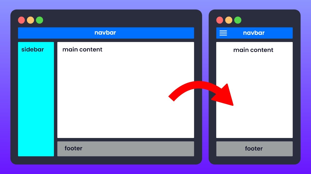
  • Responsive design: Use CSS Grid or Flexbox instead of tables for layout. This ensures it looks great on mobile.
  • Typography: Use a web font like Google Fonts (e.g., Roboto or Open Sans) at 16px base size for body text. Avoid overly large fonts.
  • Spacing: Use CSS padding and margin instead of cellpadding. Aim for at least 16px padding inside content areas.
  • Color and gradients: Use subtle CSS gradients for buttons and headers. Tools like CSS Gradient or UI gradients can help.
  • Performance: Optimize images with modern formats (WebP) and lazy loading.
  • Accessibility: Ensure proper contrast and keyboard navigation.

I’m open to all suggestions—keep 'em coming! Thanks for the feedback so far.

Topic Summary: A web designer seeks layout feedback before adding content, with community suggestions on typography, spacing, and responsive grids. Modern best practices include CSS Grid, variable fonts, and performance optimization.

:movie_camera: YouTube Video:

:books: Official Documentation & Reference Links:


Hey Josh, it’s a decent start. I’d say the layout is functional but lacks polish. Here’s my take:

  • Banner: Definitely needs a custom one. If you can’t get Photoshop, try free tools like GIMP or Canva. They have templates that can look professional.
  • Gradients: Add subtle gradients to the navigation buttons and header. It gives depth without being flashy.
  • Typography: The font is too large for the content area. I’d suggest 14-16px for body text. Also, consider using a sans-serif font like Arial or Helvetica for better readability.
  • Spacing: Add padding inside the content cells. The text shouldn’t touch the borders. Use CSS padding: 10px; or more.
  • Links: The hover cursor was weird—good you changed it. Stick with the default pointer.

Overall, it’s a 6/10 now, but with these tweaks, it could be an 8. Keep working on it!

I agree with the others. The layout is clean but needs refinement. Here are my suggestions:

  • Navigation placement: Consider moving the navigation to the right side. Most users are right-handed, so it reduces mouse movement. But if you prefer left, that’s fine too.
  • Accents: Add small design elements like arrows or borders around cells to break up the space. Look at sites like Dribbble for inspiration.
  • Cell padding: Definitely add padding. Use CSS: td { padding: 8px; } or better, use divs with padding.
  • Font size: Reduce the main content font to 14px. The headings can be larger (24px).
  • Load time: Optimize images. The placeholder banner might be large. Use compression tools.

Also, fix the poll—it’s not working. If it’s a placeholder, remove it until it’s functional.

Keep iterating! You’re on the right track.

Layout-First Design: A Strategic Approach

Starting with layout before content is a smart move that aligns with modern design thinking. It allows you to establish the structural foundation, visual hierarchy, and responsive behavior without being distracted by copy or media. This approach is especially valuable in 2026, where users expect seamless experiences across devices.

Key Modern Considerations

Responsive Grids Over Tables
The original thread mentioned tables and cellpadding. Today, CSS Grid and Flexbox are the standard. They provide fluid layouts that adapt to any screen size without fixed pixel widths. For a trick-tips site, a grid with a sidebar for navigation and a main content area that reflows on mobile is ideal.

Typography and Readability
Font size recommendations have evolved. While 14-16px was common, modern best practices suggest a base size of 16-18px for body text, with line-height around 1.5-1.6 for readability. Variable fonts and system font stacks (like system-ui) reduce load time and ensure crisp rendering.

Performance Budgets
Even before content, consider performance. Use tools like Lighthouse to audit layout efficiency. Avoid heavy images or scripts in the initial design. Lazy loading, WebP images, and minimal CSS should be baked in from the start.

Accessibility from the Start
Layout decisions impact accessibility. Ensure sufficient color contrast, keyboard-navigable menus, and proper heading hierarchy. ARIA landmarks can be added early to structure the page for screen readers.

Feedback Integration Workflow

A structured feedback loop is essential. The diagram below outlines a modern process for iterating on layout feedback before content is added.

flowchart TD
    A[Initial Layout Draft] --> B[Share with Community]
    B --> C{Collect Feedback}
    C --> D[Typography & Readability]
    C --> E[Spacing & Grid Structure]
    C --> F[Color & Visual Hierarchy]
    C --> G[Responsive Behavior]
    D --> H[Implement Changes]
    E --> H
    F --> H
    G --> H
    H --> I[Test on Multiple Devices]
    I --> J{Layout Approved?}
    J -- Yes --> K[Proceed to Content Creation]
    J -- No --> B

Final Thoughts

Layout-first design is a proven strategy that saves time and ensures a solid user experience. By focusing on structure, responsiveness, and accessibility early, you set the stage for content that truly shines. The feedback you receive now is invaluable—embrace it and iterate until the layout feels intuitive and polished.