Background effects can make or break a website’s visual appeal. In 2026, we have incredible CSS tools to create immersive, performant backgrounds without heavy images or JavaScript. Let’s dive into the most impactful techniques.
Why Background Effects Matter
A well-crafted background sets the mood, guides focus, and reinforces branding. Modern CSS allows us to create dynamic, responsive backgrounds that adapt to any screen size.
Modern CSS Gradients
Gone are the days of flat colors. Use linear-gradient and radial-gradient to create smooth transitions. For a vibrant hero section:
.hero {
  background: linear-gradient(135deg, #667eea 0%, #764ba2 100%);
}
Add multiple gradients for depth:
.background {
  background:
    radial-gradient(circle at 20% 50%, rgba(102, 126, 234, 0.3) 0%, transparent 50%),
    linear-gradient(180deg, #0a0a0a 0%, #1a1a2e 100%);
}
Animated Backgrounds
CSS animations bring backgrounds to life. Use @keyframes to move gradients or floating particles. Example of a moving gradient:
@keyframes gradientShift {
  0% { background-position: 0% 50%; }
  50% { background-position: 100% 50%; }
  100% { background-position: 0% 50%; }
}

.animated-bg {
  background: linear-gradient(-45deg, #ee7752, #e73c7e, #23a6d5, #23d5ab);
  background-size: 400% 400%;
  animation: gradientShift 15s ease infinite;
}
Parallax and Depth
Parallax scrolling creates an illusion of depth. Pure CSS parallax is now widely supported using perspective and transform. For a simple parallax section:
.parallax {
  perspective: 1px;
  height: 100vh;
  overflow-x: hidden;
  overflow-y: auto;
}
.parallax-layer {
  position: absolute;
  top: 0;
  left: 0;
  right: 0;
  bottom: 0;
  transform: translateZ(-1px) scale(2);
}
Performance Considerations
Heavy animations can hurt performance. Use will-change sparingly, prefer transform and opacity for animations (they trigger compositing), and test on lower-end devices. Also, consider using prefers-reduced-motion media query to respect user preferences.
Putting It All Together
Combine gradients, animations, and parallax to create truly unique backgrounds. The key is subtlety—don’t overwhelm the content. Experiment with tools like CSS Gradient Generator or play with clip-path for geometric shapes.
What effects have you tried? Share your projects below!
 Featured GitHub Resource:
 YouTube Video: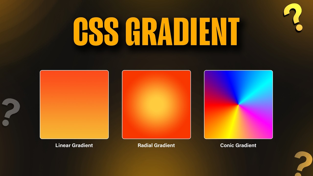
 Official Documentation & Reference Links: